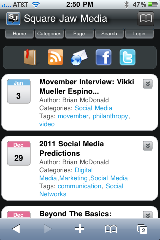
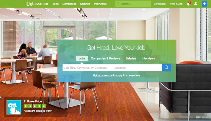
 So we know that two things are hot in business communication and marketing in 2011: mobile and video. And of course mobile video but that goes without saying since it’s a combination of the two. But with the increase of smartphones and mobile web usage, more and more people will start to access your site via a mobile device during the next several years and beyond.
Creating a mobile version of your website can be a daunting task but it does not have to be. Like all projects it requires some planning and design with realistic expectations. With this in mind I’ve created some tips on building your mobile site without too much frustration.
First determine what the mobile web experience should be for your customers, prospects, partners, etc. If you’re a local business that has a storefront, then you need something that will provide directions and easy to find phone number.
Determine what information you want on your mobile site. If you have a large site you don’t need to put everything on your mobile site. You can put a link to the full site for anyone that has to have it but determine what the key information you need on your mobile site an build pages around that.
Have a simple and easy to use navigation in place. Mobile web browsing is not easy and even more difficult if it’s hard to go from one page to the next. Have simple icons that links to your mobile pages and maybe a Home link that can take the user to the main landing page.
This seems redundant but after reading the previous two points, you don’t want more than 6-8 pages on your site and no more than two levels deep including the home page. Again look at what the mobile user experience is. Most of the time it will be to do a quick lookup to find your contact information or directions.
Keep the design clean and simple. Don’t use complicated backgrounds or image backgrounds. Use solid colors and icons sized for mobile use. If you designed a favicon for your website use that where you can. Or if you have created a good avatar for your brand use that.
If your site has a WordPress blog there are some great mobile themes like WPTouch, Carrington Mobile, News Press that will create a mobile version of your WordPress site. I use WPTouch and like the fact that I can upload my own custom icon for saving to the phone’s desktop!
If you don’t use WordPress that’s OK. Creating a mobile webpage requires some simple coding and scripts that can be placed on the main landing page to direct traffic to the appropriate site based on what type of device is viewing the page. Also check to see if your script allows you to specify mobile device types. For example can you allow iPads and tablet devices to view the site as a normal web browser resolution?
Remember to keep it simple and develop a basic mobile website with your first design. After testing, review and feedback from visitors then look at how and if you should add more to your mobile website. Chances are you may hit a home run with the first iteration and a few minor changes.


