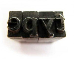
 Your choice of font paints a picture with words, effectively conveying whether your message is playful or formal, sophisticated or aimed at children. Fonts can be used to emphasize the most important parts of an advertisement or article, especially for online readers who tend to quickly scan instead of carefully read. The type of font used is just as important as the colors or background in setting the mood of a message. So with this in mind, here are some points to take into consideration when choosing fonts and how they impact upon your readers’ opinion.
1. Use Styling to Denote Importance
Font size and thickness can be manipulated with any font to divide a message into parts of varying importance. Messages or advertisements often contain one most important element. Using a large, bold font for this element, whether it is the name of a company or an important date, makes that element stand out easily. The bolder and blockier the font, the more the words will jump out at the reader. Car dealerships or furniture stores often make use of large blocky fonts to announce a special sale.
Fonts such as Swiss and Futura are ideal choices when simple, chunky fonts are needed. These fonts have no serifs, which are the wispy extensions of the bottom and top of letters found in common fonts for newspaper or magazine text. Swiss and Futura come in varying thicknesses, from light to extra black, and condensed versions are also options when space is an issue. Many advertisements end with a small disclaimer at the bottom. This should always be the smallest font size of the ad and the thinnest version of the font. In articles, copyright lines or credits would follow the same format as a disclaimer.
2. More Formal Messages Require a More Stylized Font
Script fonts such as Edwardian or Zapfino come into play here. The elegant, swooping characters extend sometimes from thick at certain points to thin at the ends, like a willow branch reaching in the wind. Ideal for businesses such as wedding planners and five-star hotels, script fonts really convey a high-class image.
In addition to script fonts, formal messages sometimes use fonts that are simpler yet highly stylized. Examples are Camelia and Bernard Fashion, which are thin, rounded fonts. Their unique look draws the good kind of attention and states that the company is fashionable. These fonts should not be used for advertisements having a lot of text, because the words will easily get lost.
Only use script or stylized fonts when the message is simple, or just use them for the major headline or company name, and use a simple font for the rest.
3. Use Different Styling of Same Font for Easy Reading
Breaking up text with different styles of the same font makes for easier reading. The first, most important line should be bold. If there is a subheading underneath that, it could be italicized. Then, the main body should be regular text, which is called “Roman” or “Book.” If there is contact information or a company name at the end, it should be bold.
Setting up an advertisement or message in this way gives the brain an easy framework to understand and shows the chain of importance from greatest to least at a glance.
4. Use Special Display Fonts for Certain Holidays
Fonts to use for Halloween include Sand and Quake, which are squiggly, spooky typefaces, and Metropolitaines, which varies from very thick in the middle of a character to thinner and rounded outward toward the end. For Thanksgiving, Victorian and Harrington are good choices, because they have an old-fashioned yet domestic feel. For Christmas, the Snowcap font caps the top of each letter with a mound of snow. Graphic fonts such as Zapf Dingbats replace letters with images of shapes, including different types of snowflakes, which are handy to use in Christmas advertisements.
5. Italicized Fonts are Often Associated with Solemnity
Announcements such as thank-you messages for generosity of friends at a time of loss of a loved one should stick to italicized or light script fonts. Super-fancy script should not be used because the words will be hard to read. A script that has simple extensions at the tips of letters and maybe a strategically placed curl is good. Italicized versions of serif fonts like Garamond or Goudy work well, because they are easy to read yet fancier than a simple block font. Display fonts should be avoided, because they convey a more informal, happy tone.
Fonts work with all parts of an advertisement, article, or webpage to convey a solid, clear message. Elements can be manipulated to better cooperate. Background color can be altered to complement or contrast text color, or vice versa. As long as both color or shade and typeface set the same mood, the image will be enhanced by the complement. Typography does with characters what a painter does with brushstrokes. The result of both is an image that can be discerned as having a distinct mood. Proper use of fonts is key in painting the right picture.
This post was contributed by James who writes about design on the CreativeCloud. Click here if you would like to read more of his writing.


